Abstract
There appears to be a conceptual divide between the criticism of album covers and that of videos because the latter obviously move in time, as does the music they accompany, whereas the former are thought to be static. There is potential for a more nuanced, semiotic co-ordination between the imagery of album covers and the songs they accompany. After a theoretical consideration of why and how this would be the case, this paper offer critical remarks on Pink Floyd’s Ummagumma and other album covers. It concludes with a case study on Death Cab for Cutie’s video for “Home is a Fire.”
It appears that Popular Music Studies has inherited from other forms of cultural criticism a tendency to argue that still images are not as discursively complex as written, filmed and performed texts. The essential argument is that pictures are static, while the other types of cultural objects require movement in time, affording greater possibilities for multimodal analysis. We frequently find expressed the idea that there is, in the words of one design critic, a “one-to-one relationship between music albums and single, memorable images” (Walter). This critical baggage descends from the curious notion that a painting, for example, “shows” but does not “mean.” That is, it is only an image and not a set of socially constructed meanings. This misconception has been transformed in visual culture studies by iconological and semiotic theories that portray “painting as an art of signs, rather than percepts” (Bryson xii).
Without the insight that pictures “mean,” one is likely to think that album covers are less interesting than, say, music videos. In contrast, I argue that album covers, like other kinds of pictures, are erroneously thought of as “happening all at once.” Pictures take time to understand because they are semiotic objects, and the well-known semiotic co-ordination between the imagery of music videos and the songs they accompany could therefore also be at work in the case of album covers. Indeed, album covers can add a multimodal association to music that requires time to process.
The notion that album covers are not discursively complex derives from a well-entrenched philosophical position that still pictures of any sort are static representations of various elements presented at the same time (Chatman 118). This simultaneity allegedly makes it impossible for them to serve as vehicles of narratives. This has been the case since at least 1766, when German writer/philosopher G. E. Lessing reasoned that painting and poetry make use of entirely different means (Speidel). The purpose of a picture, he felt, is to create a space in which the elements of a scene are presented simultaneously. Lessing would have been familiar with the linear perspective of the Renaissance, as in Perugino’s Delivery of the Keys to St Peter (1481-82), where converging orthogonals create a systematic sense of a space that rationally determines the proportions of things represented at various distances from the viewer.

However, a viewer would have to be floating many feet off the ground to see the perspective “correctly” in the Sistine Chapel, so the space represents a conceptual, mathematical ideal rather than a perceptual illusion of space receding from the viewer. The “science” of this approach is what earned Renaissance art the reputation of being more than a skilled craft, and other writers of Lessing’s era, most notably Immanuel Kant and Georg Hegel (Mansfield 11), lionized art generally as a philosopher’s way to express a higher truth. In spite of this, critical analysis of the specific meanings of such images only started to appear in the nineteenth century. Then, writers like Germany’s A. H. Springer and France’s Adolphe Didron and Émile Mâle began to develop the analysis of signs and symbols that would become the systematic explanation of iconography in the works of Aby Warburg, Fritz Saxl and Erwin Panofsky in the twentieth century (Kleinbauer & Slavens 60).
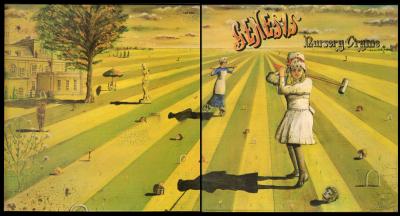
Perhaps static images continue to impress viewers as being “all at once” because linear perspective is still a commonplace device. It can be found on many album covers, like that for Genesis’s Nursery Cryme (1971), where it is created by hand;
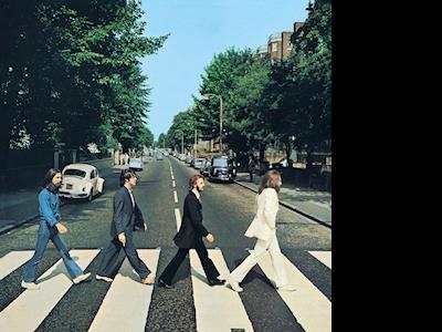
The Beatles’ Abbey Road (1969), where it is created by exploiting the perspective distortions inherent to certain camera lenses (Abbey Road);
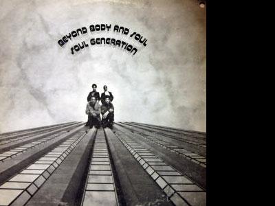
and Soul Generation’s Beyond Body and Soul (1972), where it is a visual pun switching horizontal and vertical recession.
In Lessing’s view, all of these would have been devoid of action, only depicting objects and their positions relative to each other in space. Consequently, the image would have been incapable of carrying a narrative, which is the province of poetry alone because its consecutive presentation of elements exists sequentially in time (Lessing 101).
The core of Lessing’s argument can be empirically falsified. The main objection that the image is not a true narrative depends upon the idea that it is presented all at once. This is not a convincing objection, because a poem’s words are all presented at once as well, but time is involved as the eyes trace across them (Inhoff et al.). So, too, are the parts of an image consecutively considered. People investigate images over time, just as they scan the lines of a poem to make sense of it. The only real difference is that poetry theoretically follows a predictable beginning-to-end pattern, whereas visual images invite all sorts of scansion patterns (Rosenberg & Klein). However, really savouring a poem entails a kind of retroactive re-elaboration in which a reader revisits parts of a text to make sense of them. In that regard, the consumption of poetry is actually quite like that of pictures.
Pictorial album covers, therefore, cannot truly be said to be static and therefore devoid of the kinds of actions required of narratives. The Beatles are striding over a zebra crossing, and a curious onlooker on the right turns to see what is happening. The girl on the front of the Genesis gatefold is playing croquet, while a nurse arrives in a hurry. These glimpses of action suggest a narrative potential that unfolds in association with the music they accompany. Despite this, many theorists have clung to Lessing’s basic insight, arguing that single pictures can’t be narratives but can, at best, induce them. Allegedly, images stimulate viewers to develop stories around their details through a kind of “hyperactive imagination” (Leitch 40). A story precipitated by an album cover, such writers would contend, is something that exists outside the picture akin, metaphorically, to a Rorschach test (Dieterle 135).
This line of thinking seems weirdly archaic for three reasons. First of all, we live in an era in which we understand cultural objects of all kinds as open, Barthesian texts instead of closed, determinate works (Barthes 155–164). This position renders the Rorschach inside/outside contention suspect. Second, we take intertextuality for granted, so it seems unlikely that a visual image can somehow be hermetically sealed from whatever explicatory contexts that can be brought to bear upon it. Third, and arguably most important, we routinely consume cultural objects that are not limited to one mode of presentation. For example, we have no trouble understanding the simultaneous presentation of visual images and non-diegetic music in the cinema, leading to what one theorist calls the “audio-visual surreal,” by which he means means that the experience of music is not just auditory but also cinematic, spatial and visual (Richardson). For Lessing, such cultural experiences would presumably be illegitimate because they pointedly ask us to deploy one or more modes of engagement, resulting in a “hyperactive” experience.
Artists who make still images have a variety of strategies to create an impression of narrative. Some make single images that require time to process well enough to understand what is happening. Others makes images that include various episodes within one scene. Still others simply make sequential art, like comic books.
An example of the first sort is Brueghel’s Landscape with the Fall of Icarus (1560s), in which one notices crucial details in a sequence that generates a natural story (Altman 213).
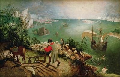
At first it’s just a landscape painting with some genre figures going about herding, farming, fishing, and sailing. Then we notice some legs flailing about in the sea on the lower right, and we realize that someone is drowning. Alerted to the possibility of tragedy, we investigate further and notice a corpse in the bushes on the far left. (Look for a slightly brighter patch in the dark area just above the horse’s head.) Speidel writes, “This painting has often been related to the Dutch saying `No plough stands still because a man dies….’ The saying is both illustrated and performed by each new viewer in her viewing process (unless, of course, she has read the title of the painting first).” The title, by the way, was added later.
Other theorists allow that pictures of the second sort, those that include various episodes within one scene, are at least a step towards a more legitimate narrative. In art history this old practice is called “continuous narrative,” in which artists show a protagonist at different stages of a story line in a single image. This concept apparently generates incomprehension among narratologists (Steiner 2), but it is quite simple: A single locale hosts a number of different actions or episodes sharing a narrative. In Masaccio’s Tribute Money (1425), for instance, we find in the centre a taxman demanding money from Christ, who directs the apostle Peter to retrieve the money from the mouth of a fish on the left.
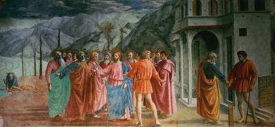
Peter then delivers the sum to the same taxman at the right. Of course, the interpretation here depends on a hypotext (Genette 5), the New Testament’s Gospel of Matthew (17: 24–27).
Narratologists seem willing to concede that the third strategy, sequential art, is narrative because it moves in time like a written text (Wolf, “Narrative” 96). While the comic strip phenomenon should be abundantly familiar to us, I will point out that there are early artworks that blend the single-image continuous narrative with the separate frames of the comics tradition. A case in point is Gentile da Fabriano’s Adoration of the Magi (1423).
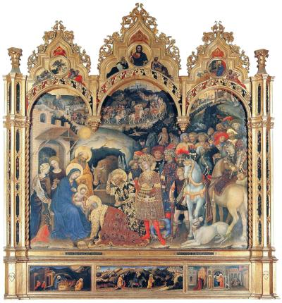
The main image features the Magi in the distance at the top left, en route in the central background, and at the birthplace in the central foreground. The comics-like elements are the smaller predella panels along the bottom, which depict the other parts of the story of Christ’s childhood: the Nativity, the Flight into Egypt and the Presentation at the Temple.
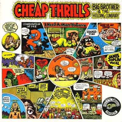
We can find similar types of sequential art in album covers. For instance, the comic book tradition clearly informs Robert Crumb’s design for the cover of Cheap Thrills (1968) by Big Brother and the Holding Company.

In it a stylized Janis Joplin appears three (and possibly four) times. These images were intended to relate a story about the band in the manner of traditional liner notes on the back of the album, but Joplin, who was a fan of underground comics and Crumb in particular, demanded that this be the front cover (Sullivan).
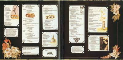
As for the continuous narrative approach, we find a fascinating example in the case of the album cover accompanying Pink Floyd’s 1969 release Ummagumma.
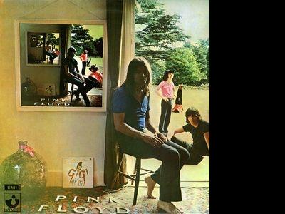
At first glance, we see a fairly conventional portrait of the band in various stages of relaxation. On the right side we see David Gilmour seated in a chair, Roger Waters seated on the floor just behind him, Nick Mason standing in the middle ground, and Richard Wright performing a leg lift in the background. Then we notice that the left side of the picture contains a copy of the whole image, as in the so-called “Droste effect” or mise en abyme of art history and film studies (Den Hartog 2011). The Droste effect features the recursive appearance within an image of a smaller replica of itself. This example varies that practice by subtly changing the elements that appear in the smaller replicas. The image on the wall rotates the band members clockwise in roughly the same positions: Waters-seated-chair, Mason-seated-ground, Wright-standing, Gilmour-leg lift. Moreover, the image within that image rotates them again: Mason-seated-chair, Wright-seated-ground, Gilmour-standing, Waters-leg lift. The iterations continue but become increasingly indistinct.
Ummagumma’s cover designer, Storm Thorgerson, adds to this fascinating rotation an extraneous detail. In the left foreground sits the soundtrack album for the 1958 film musical Gigi, directed by Vincente Minelli. He explains that it was placed there as a red herring—a signifier of the musical mainstream that Pink Floyd, then completely engaged in musical and visual experimentalism, would have considered artistically irrelevant. We might also consider whether the album’s title, Ummagumma, bears any relevance. Allegedly, it was Cambridge slang for sex, introduced to the band by roadie Ian “Emo” Moore, though some others deny it means anything at all (Povey 29). In that context, “Gigi” might also serve as a signifier of femininity. If it does so, it already illustrates the semiotic power of a still image on an album cover, for it is one of many texts that circle around each other, creating a sense of much more happening on the cover than what is simply “shown.”
A gatefold album cover like Ummagumma also functions a bit like a comic book inasmuch as one sees the inside and the outside as separate vignettes belonging to a whole that cannot be perceived all at once. Consider how one experiences the album cover while listening to the music, and vice versa. For example, experimental musique concrète passages repeat with various permutations in a track entitled “Several Species of Small Furry Animals Gathered Together in a Cave and Grooving with a Pict.” The front cover illustrates analogous permutations, while the verbal epitext of the song’s title evoke an enchanted past (a pict is a member of a tribal group living in what is now Scotland during the Iron Age). This association resonates with an image on the top left of the inside of the gatefold, a photograph of guitarist David Gilmour standing in front of the Elfin Oak in London’s Kensington Gardens.

The oak is an immensely old tree stump covered with carvings by Ivor Innes of a witch, a gnome, some elves and other little people. The word “pict” (somewhat erroneously) conjures up such beings, while the music itself is filled with strange sounds that suggest things scratching in the dirt and chattering in squeaky voices that seem altered by helium. Clearly, the visual, verbal and aural elements all inflect each other and produce a multimodal, “surreal” impression, resulting in the experience of the album as a kind of intellectual game in which one explores its intermodal intertextuality. The game is more than a mere pastime, however. It serves as a signifier that the record listener enjoys membership in a particular kind of social formation, a key strategy in late sixties popular music marketing to generate a sense of subcultural belonging (Bennett).
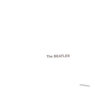
Appealing to the in-crowd is a widespread practice in album cover design. It includes experiments in legibility, for example, ranging from Richard Hamilton’s design for the Beatles’ album The Beatles (1968, a.k.a the white album)
to Trevor Jackson’s cover for Soulwax’s Any Minute Now (2004).

It also extends to what I’ll call semiotic “in-crowd mind-games” like Ummagumma. Peter Saville’s design for New Order’s Power, Corruption & Lies (1983)is an excellent example, for it fuses a nineteenth century flower painting with what looks like a printer’s colour proof swatch at the top right that turns out to be an alphanumeric code spelling out the record’s catalogue number, FACT 75.

“In this way,” writes design historian Patrick Cramsie, “Saville tapped into the same sort of feeling of knowingness and exclusivity among the band’s fans that the designers of the psychedelic poster had earlier exploited with their barely legible lettering…, creating [what journalist John Pareles called] ‘a mass produced secret’ ” (308).
Mass-produced secrets are everywhere in album cover design. Like Power, Corruption & Lies, for example, the cover of Santana’s first album (1969) doesn’t really tell us anything about the music or lyrics themselves.
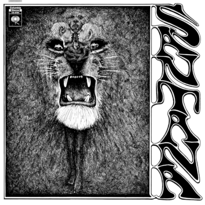
However, it does reveal much about the intellectual climate in which the record was made, as well as the mindset and expectations of record buyers in the late 1960s. Lee Conklin’s cover design exploits the psychology of what is called multistable perception by inventing ambiguous or alternating features deriving ultimately from perceptual psychology’s test images like the famous Necker cube. This example, first described in 1832, involves a constant sensory stimulation that stimulates inconstant perceptual reversals. That is, one can reorient the cube through a kind of mental effort. Most often seen as from above and slightly to the right, it appears to “open” on the front or the right side, but one can mentally change it to “open” on the top or the bottom. The effects are sequential, and one does not see them all at once (Kornmeier, Jürgen & Bach 955).
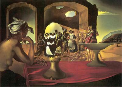
By 1933, when Salvador Dalí first published what he called the paranoiac-critical method, the alternating figure had become a method of creating in a single image a multiplicity of other images with an expanding repertoire of narrative and symbolic associations. His famous Slave Market with the Disappearing Bust of Voltaire (1940) is a case in point.
By 1969, the impact of Surrealism on posters and album covers of the psychedelic rock era was very well established, providing the context in which both Conklin and Santana first emerged. Like the music, the Santana album cover requires time to experience, with a lion’s face morphing into an African maiden in a grass skirt, a sequence of faces—some projecting whiskers, some screaming and some impassive—and a tiny figure standing just below the uppermost face at the top. Only after a time does one discover that there are also seem to be faces in the cross-hatched background—almost certainly the result of pareidolia, or the propensity to distinguish images in random patterns (Liu 60). Such an image appeals to a taste for sensory disorientation. The title, arranged vertically on the right, caters to the same appetite. As was common in the psychedelic subculture emerging in San Francisco in the late 60s, the lettering is soft and malleable—organic almost to the point of being illegible, although nowhere near as much as the flame-like fonts designed by Conklin’s San Franciscan contemporary, Wes Wilson (Marks).
The imagery doesn’t really articulate the album’s contents. The lyrics are pedestrian love songs with lines like “I’m on the pier, I’m waiting for my baby.” The music is a blend of jam rock and covers of jazz tunes modified by a taste for Latin percussion. Were it not for “Jingo Rock,” a recasting of Babatunde Olatunji’s “Jingo” (from his highly influential 1959 album Jin-Go-Lo-Ba, or Drums of Passion), there would be no African connection to the cover at all. As a result, the cover does not merely illustrate the recording; it creates a supplementary experience of deliberate illegibility and sensory disorientation for the purpose of creating a sense of subcultural social belonging. Referring to posters by the aforementioned Wes Wilson, design historian Patrick Cramsie alleges that “the resultant distortion of the letters made them somewhat illegible or … positively difficult to read, [which] was taken by fans of the music to be a positive endorsement” (271).
Album covers generate a sense of subcultural belonging in a wide variety of ways, some of which are quite cryptic and others straightforward. The latter yield to standard iconographic analysis, revealing a staging of reactions over time like that in the Brueghel above. For instance, in his contribution to Coverscaping: Discovering Album Aesthetics, Ian Chapman analyzes the cover of Kiss: Alive! (1975) according to art historical principles developed by Panofsky and others in the mid-twentieth century.
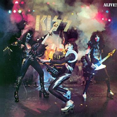
He concludes that the packaging depicted “glam-metal” well before the invention of the term by conflating the signifiers of glam rock and heavy metal. He then explains that the image appealed to him personally because of its “denial of specificity” and its iconographical ambiguity, which “afforded the opportunity for personal readings en masse” (Chapman 142). In other words, it offers us a Barthesian text, but it is different in character from the ambiguous multimodal intertextuality of Ummagumma. That is, Chapman does not link the album cover in any specific way to the music on the album. Instead, the temporal narrative is mostly (or entirely) a matter of viewer engagement and response through subcultural identification. Chapman theorizes that this is frequently how semiotic codes in album covers align to create depictions of class, gender, performativity, race, sexuality, and social belonging. The process is predictable and stable enough that some think it can be simulated in computer vision for the purpose of identifying musical genres (Jānis Lībeks & Douglas Turnbull).
Andrew Goodwin once argued that music videos can be categorized as illustrations, amplifications or disjunctures (86–89). In each case, the category is determined by the relation between the visual imagery and the lyrics. In illustration the images simply echo the lyrics. In amplification the images supplement the meaning of lyrics so as to create a whole greater than the sum of the parts. In disjuncture the images and lyrics have little or nothing to do with each other. (Think, perhaps, of Miranda Lambert’s “The House That Built Me” [2010], P!nk’s “Please Don’t Leave Me” [2009], and Fat Boy Slim’s “Praise You” [1999] as respective examples.) Some album covers can also be so understood, although I’d like to make the case for several nuances to be added to the taxonomy.
Goodwin’s notion of illustration, for example, fits Genesis’s Nursery Cryme fairly well. At the far left of the gatefold cover image, painted by Paul Whitehead, we can just make out a tiny figure standing on a ledge beneath a semicircular window while another person ascends a ladder nearby as if to make contact. This illustrates the song “Harold the Barrel,” which concerns a suicidal restaurateur standing on a window ledge while onlookers cry out, “Come off the ledge / if your father were alive he’d be very, very, very upset. / Just can’t jump, you just can’t jump.” Here the image illustrates the lyrics in a straightforward manner, working together multimodally to create an impression. This is simple lyrical illustration.
As did the photo of David Gilmour on Ummagumma, other parts of the Genesis album cover illustrate not just the lyrics but also the back-stories inspiring the songs. “The Musical Box,” for instance, was inspired by a fairy story invented by singer Peter Gabriel—seen in a faux Victorian scrapbook inside the gatefold (Genesis [inside gatefold])— in which a young girl, Cynthia Jane De Blaise-William, beheads Henry Hamilton-Smythe while playing croquet.
The ball on the front cover is the rolling head of her victim. The song also criticizes a nurse because she “will tell you lies of a kingdom beyond the skies.” She appears on the cover in the form of a nanny roller-skating into the scene while carrying a punishing whip. The lyrics themselves do not use the back-story specifically, beginning instead with the words “Play me Old King Cole,” a reference to the dead boy’s favorite tune. Consequently it falls to us to suture the bits together, expanding the idea of illustration without quite reaching the category of amplification. The imagery introduces a supplement in the record package that is not in the lyrics, upon which Goodwin’s illustration depends. We need, in other words, to add a category of “intertextual” illustration to Goodwin’s “lyrical” illustration to capture the visual equivalent of what music scholar David Cooper calls “intraopus intertextuality” (Cooper 65), or musical allusions to other signifiers drawn from within the work itself. What is being illustrated is different, but the mechanism of illustration itself is the same.
We also need a subcategory to distinguish allusions that are outside the work altogether from those that are inside the work but not in the lyrics. In this case I mean the circumstances of production and reception that do not themselves appear in the work. For instance, Chapman’s take on Kiss: Alive! is basically about deciding what genre the music is and how it’s visualized, yet the result still functions in the manner of an illustration without actually “illustrating” anything in the lyrics. We could use Cooper’s term “extraopus intertextuality,” but I am content to call it “contextual” illustration.
N.W.A.’s Straight Outta Compton (1988), designed by Helane Freeman and photographed by Eric Poppleton, serves well as an example of Goodwin’s concept of amplification applied to an album cover. It exploits a subject position that some in film studies call the “trunk shot,” a low camera angle that connotes the viewer having been captured and thrown into the trunk of a car. When N.W.A. used it, it was called a “beat-down” angle, which makes sense given that all the men in the group could not logically occupy the space around a car’s trunk in just this way (Johnson). The image doesn’t directly illustrate any of the songs, but it amplifies the tone of several of them. For instance, “Gangsta Gangsta” includes the phrase, “My man Dre’ll fuck you up in a minute / With a right left, right left you’re toothless / And then you say goddamn they ruthless!” The use of the second-person voice is equivalent to the subjective point of view in the shot. Here we encounter a type of emergent metaphor in a syntagmatic axis. Nicholas Cook—whose version of illustration, amplification and disjuncture is rendered as conformance, complementation and contest (Cook 98–106)—writes of CD jewel cases, “the very fact of juxtaposing image and music has the effect of drawing attention to the properties that they share, and in this way constructing a new experience of each; the interpretation is in this sense emergent” (73).
Goodwin’s concept of disjuncture could also be further subdivided. The cover of Beck’s Odelay (1996) is a photograph of a Komondor, a dog with a coat heavily corded like dreadlocks, engaged in agility exercises.

When asked why he used this image, Beck replied, “He looked like a bundle of flying udon noodles attempting to leap over a hurdle. I couldn’t stop laughing. Plus the deadline for the cover was a day away” (Martell 44). Designer Robert Fisher merely added the oddly retro font. But this type of disjuncture, which was very much a happy accident, is very different from the notorious original cover of The Beatles’ Yesterday and Today (1966).

The latter was an excerpt from a conceptual photo series by Robert Whitaker entitled “A Somnambulant Adventure,” which Paul McCartney, at least, saw as a commentary on the Vietnam War (Gaffney). There is, therefore, a kind of intentionality involved in the latter that is absent from the former. Beck’s subcategory of disjuncture could thus be called “arbitrary.” In contrast, The Beatles’ subcategory of disjuncture could be called “motivated.”
When something intermodally complex is involved, Goodwin’s three terms can’t quite cover all the possibilities. Jethro Tull’s Thick As a Brick (1972) is a case in point. Intended to be a parody of concept albums, TAAB, as it is sometimes called, ended up being one of the best concept albums of all time (Nollen 81). An extended song cycle based on lyrics written by a fictitious eight-year-old prodigy named Gerald Bostock, TAAB encompasses a wide variety of musical genres and themes in different tempos, time signatures, textures and timbres. Its progressive rock richness and diversity is articulated and expanded in Roy Eldridge’s cover design, which takes the form of an entire small-town newspaper, The St. Cleve Chronicle and Linwell Advertiser. This astonishing supplement to the performance, which singer Ian Anderson said took longer to create than the music (Rees 49), satirizes the homespun style of articles and advertising in local English broadsheets. One story outlines the poetic disgrace of the fictional Bostock, who was disqualified from a poetry contest for vulgar and offensive passages like “Your sperm’s in the gutter, your love’s in the sink” and “With their jock-straps pinching, they slouch to attention.” Other parts of the newspaper reproduce the entire poem (that is, all the lyrics), various puns and absurd running jokes (one of which concerns an “experimental non-rabbit”), a children’s puzzle, and even a negative review of the music. Clearly, the idea that an album cover (like a picture) is perceived all at once could not be further from the truth.
One can listen to TAAB and read the lyrics as they appear in the music. One can listen to TAAB while creating a mental debate with the music reviewer. One can scan the newspaper for accidental alignments of meaning, with the wide variety of tunes and tones resonating in diverse ways with the different points of view and subjects discussed in the homespun tabloid. One can even find, while listening, that one is looking at something whose connection to the aural at that moment is absurd and meaningless. At any moment, the music resonates with or collides against the verbal texts, and the visuals bounce erratically between. The experience of the whole is clearly not reducible to any one of Goodwin’s categories. It is, at times, illustration, amplification and/or disjuncture. This we could call “massively contingent intermodality.”
I suggested at the beginning that music videos might also be profitably informed by the critical language applied to still pictures. There are a few music videos that approach the condition of still pictures inasmuch as they change so little that no significant inflection of meaning accumulates due to jarring pictorial changes. For instance, the iconic 1990 video for Sinéad O’Connor’s cover of Prince’s “Nothing Compares 2 U,” directed by John Maybury, is remembered mostly for its relentless close-up of the singer’s face. It does have a very few, more obviously “narrative” elements (e.g., a figure striding past a fountain in a Parisian park and the superimposed head of a statue), but we all seem to forget these because the lasting impression is of her striking features and and her tears, which amplify the emotional tone of the lyrics in general and directly illustrate one of the sung lines. This example of lyrical illustration contrasts with the contextual illustration of tears in Yeah Yeah Yeahs’s song “Maps” (2004), the video of which shows singer Karen O breaking down and crying because her boyfriend had not yet shown up for the shoot as promised (WENN). This is not to say that O’Connor’s tears aren’t also real, but they are linked to the lyrics, while Karen O’s are linked only to her personal circumstances.
It is difficult to say much more about “Nothing Compares 2 U” in the standard terms associated with music video criticism as they appear in, say, the work of Carol Vernallis. For example, the camera movement is minimal, and there are no jump cuts, changes in pacing, graphic matches, or cutting with the lyrics. What we’re left with is framing, which certainly draws our attention to every nuance of her expression (not to mention her star status), and possibly breaking the fourth wall. The latter, however, usually entails a conspiratorial tone in which the filmed subject is aware of and engaged by the audience in a way not clearly suggested here. O’Connor is merely looking in our direction, neither connoting the fictional nature of the account being presented nor giving viewers an opening to consider themselves somehow within the story. It lacks, in other words, a metareferential element (Wolf, Metareference 45). When we compare O’Connor’s image to Joseph Ducreux’s Portrait de l’artiste sous les traits d’un moqueur (ca. 1793), we see that the latter has a metareferential character that the former lacks.
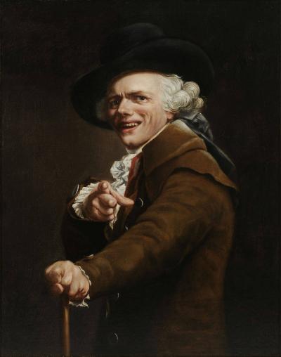
Ducreux’s work breaks the fourth wall so overtly (and so oddly) that the painting is now infamous for appearing in hundreds of online memes sometimes categorized as “archaic rap” (“Joseph Ducreux/Archaic Rap”). There is a kind of narrative engagement in the painting that the video, as affective as it is, does not match.
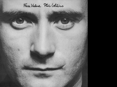
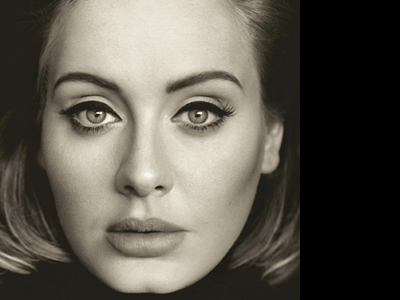
Closely framed, directly confrontational images of this sort are fairly rare in music videos but quite common in portrait paintings, where we would be likely to rely on a number of concepts deriving from art criticism, such as figure-to-ground proportions, balance, focus, texture, and lighting. These terms can also be used to assess hundreds of album covers that exhibit the same kind of tight framing and eye-to-eye intimacy, ranging from Phil Collins’s Face Value (1981)
to Adele’s 25 (2015).
One of the more arresting is Miles Davis’s Tutu (1986), a collaboration between male and female artists, in this case designer Eiko Ishioka (who won a Grammy for best album package) and photographer Irving Penn (Gallafent).
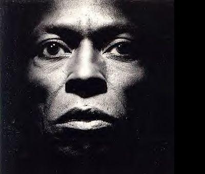
This example is interesting because the pictorial elements alone, not the iconography, create the desired impression. The foremost device in Tutu is the lighting, which evokes a ruggedly individual, almost spiritual mood in keeping with Davis’s reputation as a talented but irascible guru and musical game-changer. With such an image in mind, we return to the O’Connor video to find that its lighting is comparatively flat and inexpressive. Consequently, we must attribute the emotional effect of the video to O’Connor’s acting, which visually enhances the music’s beautiful but nearly elegiac mood even before we understand that the lyrics are about a broken relationship.
I am tempted to appropriate Michel Chion’s expression “anempathetic” here, turning it to a slightly different purpose. He coined the word to refer to music or sound effects in a film that are noticeably unresponsive or indifferent to the mood or narrative being portrayed. This is typically non-diegetic, as in a fight scene in Guy Ritchie’s film Snatch (2000), which is accompanied by the lilting 1981 Stranglers tune “Golden Brown.” A notorious diegetic example appears in Stanley Kubrick’s A Clockwork Orange (1971), when the sociopathic character Alex performs the upbeat song “Singin’ in the Rain” while physically and sexually assaulting two victims in their own home. The jarring result creates a sense of irony, tragedy, apathy and/or unimportance. In O’Connor’s video, the polarity is reversed: the music and lyrics provide the narrative and the visuals supplement them diegetically, in effect. That is, the imagery, not the music, works anempathetically. The flat lighting and unchanging field of vision seem almost disinterested—certainly in comparison with Tutu—creating a kind of tension with the emotion being expressed aurally. That tension only breaks when the singer’s tears begin to fall.
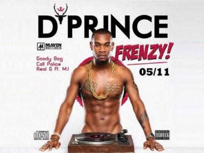
D’Angelo’s Untitled (How Does It Feel) (2000), directed by another male/female team, Paul Hunter and Dominique Trenier, is more explicitly metareferential. Like “Nothing Compares 2 U,” it is one shot, but it exploits a limited range of camera movements that explore the singer’s apparently nude body in a sexually suggestive way. Hunter said, “We made this for the women. The idea was, it would feel like he was one-on-one with whoever the woman was” (Peisner). Here the singer’s direct address to an implied female viewer creates an impression that she actually is involved in the narrative rather than just witnessing it. In art history, similar male nudes are very common, especially when we include academic studies like Jean Auguste Dominique Ingres’s Male Torso (1801).

While such images were typically student exercises intended to have no sexual function, the lyrics to D’Angelo’s song are expressly inviting the implied female viewer to “come closer 2 me baby.” Among the many album covers that exhibit a similar iconography are D’Angelo’s own album cover, D’Prince’s Frenzy (2012),
Mac Miller’s Watching Movies with the Sound Off (2013),

and Darey’s Naked (2015), which crop, interpose or shadow things in the scene that might be too explicit. (There are examples that show more.)
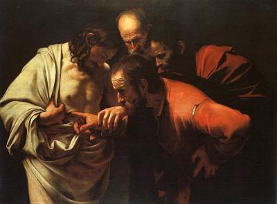
There are many music videos that deliberately exploit art historical intertexts. Tarsem Singh’s video for R.E.M.’s Losing My Religion (1991) explicitly alludes to Caravaggio’s The Incredulity of Saint Thomas (1601-02) (Buckley 206-07).
Similarly, Catherine Wheel’s Crank (1993) alludes to all sorts of Christian iconography, ranging from Byzantine icons (at one point singer Rob Dickinson appears framed by a cymbal like a gold halo) to scenes of the Nativity and the Last Supper (which here takes place in an elevator). The lyrics these videos present could arguably be interpreted in the light of religious images through massively contingent intermodality, but other videos seem to offer celebrated paintings more as novelties than anything constitutive of the final meaning of the work. The song “70 Million,” 2011, by Hold Your Horses! features the band performing tableaux vivants of famous artworks by Caravaggio, Leonardo, Rembrandt, Michelangelo, Picasso, Van Gogh and nineteen others, but any semiotic coordination with the lyrics would be a stretch. There are, however, music videos in which the lyrics, music and visuals come together in a multimodal synthesis that includes the significance of the still image on the album cover. A case in point is Death Cab for Cutie’s “Home is a Fire” (2011) from the album Codes and Keys.
Death Cab for Cutie has long been characterized as presenting emotionally earnest material in a curiously expressionless way, much like the alternative bands the Stone Roses and Radiohead. The video for “Home is a Fire” develops an extended metaphor in which a secure “home” has given way to uncertainty and instability (Death Cab for Cutie, “Home”). The world is not without a melancholy beauty, but it has nonetheless become derelict in many ways.
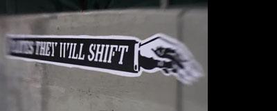
Even without the lyrics, the musical form of the song lends itself to an interpretation of instability. A guitar establishes a beat by rhythmically stopping the strings rather than allowing them to ring freely. This pattern continues throughout the piece without significant chord changes (except perhaps for minor-to-major changes in the second appearance of the phrase “Nothing’s the same”). The drums play incidental flourishes rather than a conventional beat until the first chorus (“Home, home is a fire”), at which point a high-hat subtly provides regular structure on the backbeat. The second chorus brings the full drum kit more forward. At a later point (corresponding with the phrase “Plates, they will shift”), a seemingly double-timed, electronic beat low in the mix provides additional rhythm and energy. However, the melody floats slowly above and against this background, almost as if detached from and unrelated to the rhythm track. Another guitar plays a slow, more openly ringing counterpoint against the melody.
The form of the lyrics is similarly unstable, arranged in a seemingly haphazard manner that matches the contrasted elements of the music. For example, the stanzas seem to be three, six, seven, three, four and nine lines long, and their delivery in melody seems to stretch out in different lengths against the insistent rhythm. There is no clear rhyme scheme.
Visually, the guitar intro is accompanied by a rhythmically presented series of short clips of palm trees “interrupted” in a manner similar to and timed with the first guitar track. The initial impression that the video is meant to be inherently aligned with and complementary to the musical track (and not the lyrics) is confirmed when the vocals start, at which point the sequence changes to mixed shots edited to coincide with the notes of the second guitar part. The axis of this connection is thus editing⬄music. A little later, the alignment runs along a different axis, editing⬄ visuals, for the shots are then cut on key elements of the lyrics (expressly visually) instead of the music (e.g., when the lyrics start to appear on buildings). The visuals thus become paraphrases of the lyrics, timed to coincide with the music.
The meaning effect of this shift of axes is a mood that is uncertain and predominantly contemplative, yet somehow energetic and insistent. The video creates the impression that someone is dreamily singing along with a track to which his melody does not really quite belong. Against this background of formal tension, the lyrics build an extended metaphor in which “home” is both acknowledged as a place to belong and compared to signs of instability and uncertainty. The bricks of the “walls built up around us” make the singer “nervous/[because] They’re only so strong.”

Meanwhile, presumably tectonic “Plates, they will shift/[and] Houses will shake.” After the earth moves, the singer says “We will awake” - he seems to be addressing someone he loves—“Only to find/Nothing’s the same.” The lyrical metaphor of love and modern alienation seems to be built on the vehicle of an earthquake.
The visuals achieve a similar effect when a heavy echo repeats the word “find” (from the line “Only to find”). The shots are then cut on the lyrical echoes, sewing the music, the lyrics and the visuals together. Some of these shots slowly track in on an element of interest, with occasional uses of rack focus and/or diffusing lenses that serve both to direct and to confound our attention.
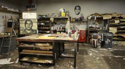
The shots are of seedier parts of Los Angeles, including back alleys, derelict buildings, decaying infrastructure, graffiti, industrial landscapes, and—perhaps most explicitly—metonyms of homelessness (e.g., an abandoned mattress under a bridge). Another sequence takes place in the studio of an artist who is preparing some posters that he is later seen plastering here and there in the city.
They bear texts mirroring the lyrics—sometimes exactly, sometimes not—and some have additional imagery, like a fire accompanying “Home is a fire” and a kind of robotic creature with an exposed heart and flaming hair accompanying “A burning reminder of where we belong.”

The video’s final sequence is a series of nearly aerial night shots of Los Angeles, progressively going out of focus until the city lights are nothing more than fuzzy, abstract orbs. The very last shot is of a darkened room and a doorway open to bright light beyond.
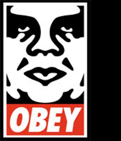
Given a very specific emergent meaning of doubt and insecurity, one is tempted to see the video’s meaning as the product of a single mind. However, the band’s official website states that the video “is a result of ten people,” with the largest contributions made by bassist Nick Harmer and collaborator Shepard Fairey (Death Cab for Cutie, Official Website). Fairey is best known as the artist who created the late 1980s’ street-art series known as “Obey” (in which the artist used a commanding image of wrestler André the Giant)
and the famous Obama “Hope” poster of 2008 (Harmer).
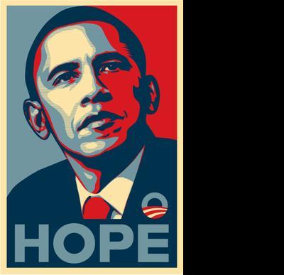
The former is conceptually reminiscent of Andy Warhol’s celebrity portraits (e.g., Marilyn Monroe, Mick Jagger), and the latter is stylistically similar to Warhol’s portraits of Che Guevara (particularly in the use of flat patterns of unnatural, saturated colour). Perhaps it is for that reason Warhol is briefly name-checked in the video sequence of the artist’s studio.
The pop sensibility, however, is usually visually clear and crisp. In contrast, it is here confounded by indistinctness and shifting visual terrain. This visual approach is in line with the musical decisions the band made during the recording sessions. Guitarist and co-songwriter Chris Walla explained that the band made production choices seeking “less photograph, more impressionism” (Wallen). To that end, they were deeply influenced by David Bowie’s album Low (RCA, 1977), which he described as an album that emphasized studio-crafted “sonic elements” rather than memorable melodies. Similarly, singer and co-songwriter Benjamin Gibbard added that the album was influenced by Brian Eno’s experimental work Another Green World (1975), which was similarly dreamlike and moody (Goodman). The latter had been composed in part by chance: In the studio the musicians used flashcards created by Eno and Peter Schmidt—the so-called “Oblique Strategies”— which were intended to provoke fresh thinking with vague instructions to think outside the box (for example, “Use an old idea” and “Ask your body”). The consequence of this collective, randomizing method is the thematic meaning effect of tentativeness and indeterminacy. The video finds a way to express a similar mood.
“Nothing’s the same,” say the lyrics, “There’s nowhere left to go,” and “Home, home is a fire/Burning reminder/Of where we belong.”
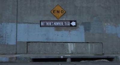
These sentiments are embedded in ephemeral clouds of music and suggestive, fleeting urban visuals that create an evocative mood cautioning us to have doubts about our comfort and security. The final shot is profoundly ambiguous: Is the doorway a figurative way out of this state of mind, or is it intended to represent the unknown beyond the end? Either way, we remain poetically uncertain.
Endemic uncertainty is, it seems, also the point of the album cover design by bassist Nick Harmer.
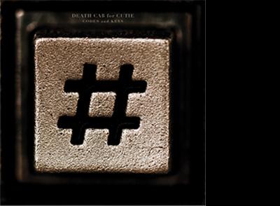
It features a closely cropped pound key from a telephone—the sort one would see in a phone booth. Of course, many younger listeners will never have seen a phone booth because they started to disappear as early as the 1970s (Stamp). Millenials will imagine the design to be a hashtag like that used on Twitter. The telephone’s “key,” therefore, offers a “code” that can be read in more than way, like a linguistic shifter whose meaning varies depending on its context. Here, the device signifies both past and future. On Twitter, a hashtag initiates a portion of a communication. On a telephone, the pound key typically terminates one, as in the case of entering a bank account number “followed by the pound key.” The same sign therefore does double duty, indicating that something is both beginning and ending. “Home is a Fire” and its video draw semiotic axes between the opposite poles of “home/comfort/security” and “afire/uncertainty/nowhere left to go.” The album cover symbolizes a similar polar opposition and thus supplements the content of the video through emergent amplification.
In the light of this reasoning, I don’t think it is coincidental that certain music reviewers are now coming to realize that Codes and Keys is more complex and nuanced than originally thought. When it first came out, writers described it in the light of a new, seemingly happy marriage between singer Gibbard and actress Zooey Deschanel. The critics argued that the music was weak—even a bit sappy because it was settled and comfortable. But the marriage failed within half a year, and reviewers are now starting to see the work as a masterpiece that foreshadows the unfortunate domestic failure (Caffrey). It is both a celebration and a lament. The album cover’s deliberately ambiguous sign thus resonates with the song’s wistful appeal to past and future against a background of doubt and insecurity. Those who figure out these connections are part of an elite in-crowd.
I have argued that we might profitably consider album covers as narratives, which therefore gives them the potential to be connected to music and lyrics in a greater variety of ways than simply identifying the performer and his or her musical genre. Album covers are thought of as typically speaking to collections of songs, but I have attempted to show how they might also bear a relationship to individual tunes. I have also asserted that the terms we use to describe the taxonomy of intermodal relations needs to be expanded to capture interstitial nuances like lyrical, contextual and intertextual illustration; lyrical versus emergent amplification; arbitrary versus motivated disjuncture; and massively contingent intermodality. Lastly, I have proposed that we expand the audio-visual term “anempathetic,” which usually refers to the way music supplements our understanding of images, to include its opposite, how some images supplement our understanding of music. The formal analysis of videos will necessarily involve different approaches to, say, editing and camera movement (Vernallis xi-xiii). However, I feel that many of the other critical concepts applied to videos can also serve to investigate the functions of album covers, which produce narratives and invitations to subcultural membership as emergent properties of various types of intertextual relationships.
Note: This paper is a development of ideas presented in “The Narrative Potential of Album Covers,” Studies in Visual Arts and Communication: An International Journal 2. 2 (2015): http://tinyurl.com/h245cqy
References
“The Abbey Road Cover Photography Session | The Beatles Bible.” The Beatles Bible. N.p., n.d. Web. 25 May 2015. .
Adele. 25. London: XL, 2015. Web. 16 June 2016. .
Barthes, Roland. “From Work to Text.” Image, Music, Text. Trans. Stephen Heath. New York: Hill and Wang, 1977. 155-64. Print.
Beatles, The. Abbey Road. London: Apple, 1969. Designer: John Kosh. Photographer: Iain Macmillan. Web. 11 January 2016. .
—. The Beatles (The White Album). London: Apple, 1968. Designer: Richard Hamilton. Web. 11 January 2016. .
—. Yesterday and Today. Photographer: Robert Whitaker. Los Angeles: Capitol, 1966. Web. 11 January 2016. .
Beck (Beck Hansen). Odelay. Santa Monica: DGC Records, 1996. Art director: Robert Fisher. Web. 11 January 2016. .
Bennett, Andy. “Consolidating the Music Scenes Perspective.” Poetics 32 (2004): 223–234.
Big Brother and the Holding Company. Cheap Thrills. New York: Columbia, 1968. Web. 11 January 2016. Cover artist: Robert Crumb. .
Brueghel, Pieter. Landscape with the Fall of Icarus. Brussels: Royal Museums of Fine Art, 1560s. Web. 11 January 2016. .
Bryson, Norman. Vision and Painting: The Logic of the Gaze. New Haven: Yale, 1983. Print.
Buckley, David. R.E.M.: Fiction: An Alternative Biography. London: Virgin, 2002. Print.
Caffrey, Dan. “Revisiting Death Cab for Cutie’s Codes and Keys.” Consequence of Sound. Web. 31 March 2015. .
Caravaggio, Michelangelo Merisi da. The Incredulity of Saint Thomas. Potsdam: Sanssounci, 1601-02. Web. 11 January 2016. .
Catherine Wheel. Crank. Los Angeles: Fontana Records, 1993. Director: Unknown. Web. 11 January 2016 .
Chapman, Ian. “Kiss: Alive! An Iconographical Approach.” Coverscaping: Discovering Album Aesthetics. By Asbjørn Grønstad and Øyvind Vågnes. Copenhagen: Museum Tusculanum, 2010. 132-43. Print.
Chatman, Seymour. “What Novels Can Do That Films Can’t (and Vice Versa).” On Narrative. Ed. W. J. T. Mitchell. University Press: Chicago, 1981. 117-36. Print.
Chion, Michel. Audio-Vision: Sound on Screen. New York: Columbia University Press, 1994.
Collins, Phil. Face Value. London: Virgin, 1981. .
Cook, Nicholas. Analysing Musical Multimedia. Oxford, Clarendon Press, 1998. Print.
Cooper, David. Bernard Herrmann’s “Vertigo.” Westport: Greenwood, 2001.
Cramsie, Patrick. The Story of Graphic Design: From the Invention of Writing to the Birth of Digital Design. New York: Abrams, 2010. Print.
da Fabriano, Gentile. Adoration of the Magi. Florence: Uffizi, 1423. Web. 11 January 2016. Web. 11 January 2016. .
Dalí, Salvador. “Interprétation paranoïaque-critique de l’image obsédante L’Angélus de Millet.” Minotaure 1 (February 1933): 65-67. Print.
—. Slave Market with the Disappearing Bust of Voltaire. St. Petersburg: Salvador Dalí Museum, 1940. Web. 11 January 2016. .
D’Angelo (Michael Eugene Archer). Untitled (How Does It Feel). Directors: Paul Hunter and Dominique Trenier. London: Virgin, 2000. Web. 11 January 2016. .
Darey. Naked. Lagos: Livespot, 2015. Web. 16 June 2016. .
Davis, Miles. Tutu. Burbank: Warner Brothers Records, 1986. Web. 11 January 2016. Designer: Eiko Ishioka. Photographer: Irving Penn. .
Davis, Whitney. A General Theory of Visual Culture. Princeton, NJ: Princeton UP, 2011. Print.
Death Cab For Cutie. “Home is a Fire.” Music video. Dir. N. Harmer and S. Fairey. Atlantic, 2011. YouTube. Web. 2/9/2015. 16 June 2016. .
Den Hartog, Ben. “The Droste Effect on Pink Floyd Album Ummagumma.” OtherFocus (11 November 2011). Web. 11 January 2016. .
Dieterle, Bernard. Erzählte Bilder. Zum narrativen Umgang mit Gemälden. Marburg: Hitzeroth, 1988. Print.
D’Prince. Frenzy. Lagos: Mavin Records, 2012. Web. 16 June 2016. .
Ducreux, Joseph. Portrait de l’artiste sous les traits d’un moqueur. Louvre, ca. 1793. Web. 16 June 2016. .
Gaffney, Dennis. “The Beatles “Butcher” Cover.” PBS, Antiques Roadshow, Follow the Stories. PBS.org, 27 Oct. 2008. Web. 22 May 2015. .
Gallafent, Alex. “Looking Back on the Career of Designer Eiko Ishioka.” Public Radio International. N.p., 31 Jan. 2012. Web. 26 May 2015. .
Genesis. Nursery Cryme. London: Charisma, 1971. Web. 11 January 2016. Illustrator: Paul Whitehead. .
Genesis [inside gatefold]. Nursery Cryme. London: Charisma, 1971. Web. 11 January 2016. Illustrator: Paul Whitehead. .
Genette, Gérard. Palimpsests: Literature in the Second Degree. Trans. Claude Doubinsky. Lincoln: University of Nebraska Press, 1997. Print.
Goodman, William. “Ben Gibbard ‘So Proud’ of New Death Cab Album.” SPIN.com. Web. http://www.spin.com/articles/bengibbard-so-proud-new-death-cab. 2/9/2015.
Goodwin, Andrew. Dancing in the Distraction Factory: Music Television and Popular Culture. Minneapolis: U of Minnesota, 1992. Print.
Harmer, Nick. “Death Cab For Cutie’s ‘Home Is A Fire” Video.” Obey: Manufacturing Quality Dissent Since 1989. Web. http://www.obeygiant.com/headlines/death-cab-for-cutie-home-is-a-fire-video. 2/9/2015.
Hold Your Horses! 70 Million. 2011. Web. 16 June 2016. .
Ingres, Jean Auguste Dominique. Male Torso, ca. 1801? Web. 16 June 2016. .
Inhoff, W. Albrecht, Brianna M. Eitner, and Ralph Radach. “Time Course of Linguistic Information Extraction From Consecutive Words During Eye Fixations in Reading.” Journal of Experimental Psychology: Human Perception and Performance 31.5 (2005): 979-95. Web. 25 May 2015. .
Jethro Tull. Thick As a Brick. London: Chrysalis, 1972. Web. 11 January 2016. Designer: Roy Eldridge. .
Johnson, Christopher. “ ‘Straight Outta Compton,’ 20 Years Later.” NPR. NPR, 4 Dec. 2007. Web. 22 May 2015. .
“Joseph Ducreux/Archaic Rap.” Know Your Meme. http://knowyourmeme.com/memes/joseph-ducreux-archaic-rap
Kleinbauer, W. Eugene, and Slavens, Thomas P. Research Guide to the History of Western Art. Chicago: American Library Association, 1982.
Kornmeier, Jürgen, and Michael Bach. “The Necker Cube: An Ambiguous Figure Disambiguated in Early Visual Processing.” Vision Research 45.8 (2005): 955-60. Web. 19 May 2015.
Leitch, Thomas M. What Stories Are: Narrative Theory and Interpretation. University Park: Pennsylvania State UP, 1986. Print.
Lessing, Gotthold Ephraim. Lessings Laokoon. Carlsruhe: Büreau der Deutschen Classiker, 1824. Print.
Lībeks, Jānis and Douglas Turnbull. “You Can Judge an Artist by an Album Cover: Using Images for Music Annotation.” IEEE Multimedia 18.4 (2011): 30-37. Web.
Liu, Jiangang, Jun Li, Lu Feng, Ling Li, Jie Tian, and Kang Lee. “Seeing Jesus in Toast: Neural and Behavioral Correlates of Face Pareidolia.” Cortex 53 (2014): 60-77. Web. 19 May 2015.
Mansfield, Elizabeth. Making Art History: A Changing Discipline and Its Institutions. New York: Routledge, 2007.
Marks, Ben. “Where Hard Rock Meets Pop Art.” The New York Times Style Magazine. The New York Times (Style Magazine) (7 October 2011). Web. 16 October 2011. .
Martell, Nevin. Beck: The Art of Mutation. New York: Pocket, 2001. Print.
Masaccio (Tommaso di Ser Giovanni di Simone). The Tribute Money. Florence: Brancacci Chapel, 1425. Web. 11 January 2016. .
Miller, Mac. Watching Movies with the Sound Off. Los Angeles: Rostrum, 2013. Web. 16 June 2016. .
New Order. Power, Corruption, Lies. Manchester: Factory, 1983. Web. 16 June 2016. Designer: Peter Saville. .
Nollen, Scott Allen. Jethro Tull: A History of the Band, 1968-2001. Jefferson, NC: McFarland, 2002. Print.
“Nursery Cryme.” Wikipedia. Wikimedia Foundation, n.d. Web. 22 May 2015. .
N.W.A. Straight Outta Compton. Chicago: Ruthless, 1988. Web. 11 January 2016. Designer: Helane Freeman. Photographer: Eric Poppleton. .
O’Connor, Sinéad. “Nothing Compares 2 U.” London: Chrysalis, 1990. Web. 11 January 2016. Director: John Maybury. .
Pareles, Jon. “New Order Keeps Marching to Its Own Mystery.” The New York Times. The New York Times, 11 Feb. 1989. Web. 26 May 2015. .
Peisner, David. “D’Angelo: What the Hell Happened?” SPIN (2008): n. pag. Spin. 05 Aug. 2008. Web. 22 May 2015. .
Perugino, Pietro. Delivery of the Keys to St Peter. Vatican, 1481-82. Web. 11 January 2016. .
Pink Floyd. Ummagumma. London: Harvest, 1969. Web. 11 January 2016. Designer: Storm Thorgerson. .
Povey, Glenn. Echoes: The Complete History of Pink Floyd. Bovingdon: Mind Head Publishing, 2007. Print.
Rees, David. Minstrels in the Gallery: A History of Jethro Tull. Wembley: Fire Fly, 1998. Print.
R.E.M. Losing My Religion. Burbank: Warner Brothers Records, 1991. Web. 11 January 2016. Director: Tarsem Singh. .
Richardson, John. An Eye for Music: Popular Music and the Audiovisual Surreal. Oxford: Oxford University Press, 2011.
Rosenberg, Raphael, and Klein, Christoph. “The Moving Eye of the Beholder: Eye Tracking and the Perception of Paintings,” 79–110. Art, Aesthetics and the Brain. Eds. J. P. Huston, et al. Oxford: Oxford University Press, 2014.
Santana. Santana. New York: Columbia, 1969. Illustrator: Lee Conklin. Web. 16 June 2016. .
Soul Generation. Beyond Body and Soul. Newark: Ebony Sounds Records, 1972. Designer: Unknown. Web. 11 January 2016. .
Soulwax. Any Minute Now. London: PIAS Recording, 2004. Web. 11 January 2016. Designer: Trevor Jackson. .
Speidel, Klaus. “Can a Single Still Picture Tell a Story? Definitions of Narrative and the Alleged Problem of Time with Single Still Pictures.” Diegesis. N.p., 2013. Web. 19 May 2015. .
Stamp, Jimmy. “The Pay Phone’s Journey From Patent to Urban Relic.” Smithsonian Magazine. 18 September 2014. Web. 16 June 2016. .
Steiner, Wendy. Pictures of Romance. Form against Context in Painting and Literature. Chicago: University of Chicago Press, 1988. Print.
Sullivan, James. “ ‘Cheap Thrills,’ Big Brother & the Holding Company - ‘R. Crumb: The Complete Record Cover Collection’ ” R. Crumb: The Complete Record Cover Collection. Rolling Stone, 21 Dec. 2011. Web. 22 May 2015. .
Vernallis, Carol. Experiencing Music Video: Aesthetics and Cultural Context. New York: Columbia UP, 2004. Print.
Wallen, Doug. “Death Cab for Cutie: Interview” Thevine.com.au. Web. http://www.thevine.com.au/music/interviews/death-cab-for-cutie-interview20110524.aspx. 9/21/11.
Walter, John L. “Reason and Rhymes.” Eye 63.17 (2007): n. pag. Web. 20 May 2015. .
WENN. “Yeah Yeah Yeahs: Karen O’s Video Crying Was For Real.” Contactmusic. 12 July 2007. Web. 16 June 2016. .
Wolf, Werner. “Narrative and Narrativity: A Narratological Reconceptualization and Its Applicability to the Visual Arts.” Word & Image 19.3 (2003): 180-97. Web. 19 May 2015. .
Wolf, Werner, et al. eds. Metareference across Media: Theory and Case Studies. Amsterdam: Rodopi, 2009.
Yeah Yeah Yeahs. Maps. Santa Monica: Interscope, 2004. Web. 16 June 2016. Director: Patrick Daughters. .